默认布局与定位布局
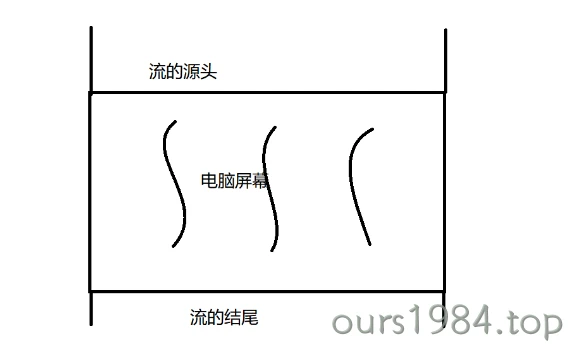
文档流指的是什么呢?由于这是显示在浏览器上面的,显示在电脑屏幕前的。如果我们将屏幕的两侧想象成河道,将屏幕的上面作为流的源头,将屏幕的底部作为流的结尾的话,那我们就抽象出来了文档流 !
文档布局流
- 元素显示顺序 = 元素在源码中的书写顺序
- 元素的排列位置,具有"预测性"
- 文档流 -> 文档布局流 -> 正常布局流
- 默认定位: position: static (静态定位)
元素布局完整流程
- 把内容(匿名文本)放到一个独立的,矩形的盒子: 盒模型
- 将内容放到什么样的盒子中? 就决定了这是什么类型的元素
- 为这个矩形盒子,添加上padding,border,margin
- padding: 内边距
- margin: 外边距
- padding, margin,不可见,但可感知它的存在,如空气,只可以设置宽度
- border: 边框 / 边界 / 盒子计算大小的依据
那文档流流动的又是什么呢?那就是元素!可以将屏幕中显示的内容都可以一一对应为文档中的一个元素,在这里就引出两个概念:内联元素与块级元素
内联元素和块级元素
块级: display: block / table / table-cell,td / list-item / form / p / h1-h6/...
- 宽度: 总是占据父级的全部宽度 100%
- 高度: 由内容决定
- 可以自定义宽高
- 排列: 垂直
内联/行内: 用来描述块级元素内部的内容/文本
- 高度: 内容高度
- 宽度: 内容宽度
- 宽高不能自定义
- padding有效,margin只有左右有效
- 排列: 水平, 排不下,则换行显示
- display: inline
可以将内联元素转为块级,使宽高生效,
这时后面的其它元素垂直排列display: block
如果不想让后面的元素换行显示/垂直排列,可以将它转为内联块/行内块
display: inline-block; |
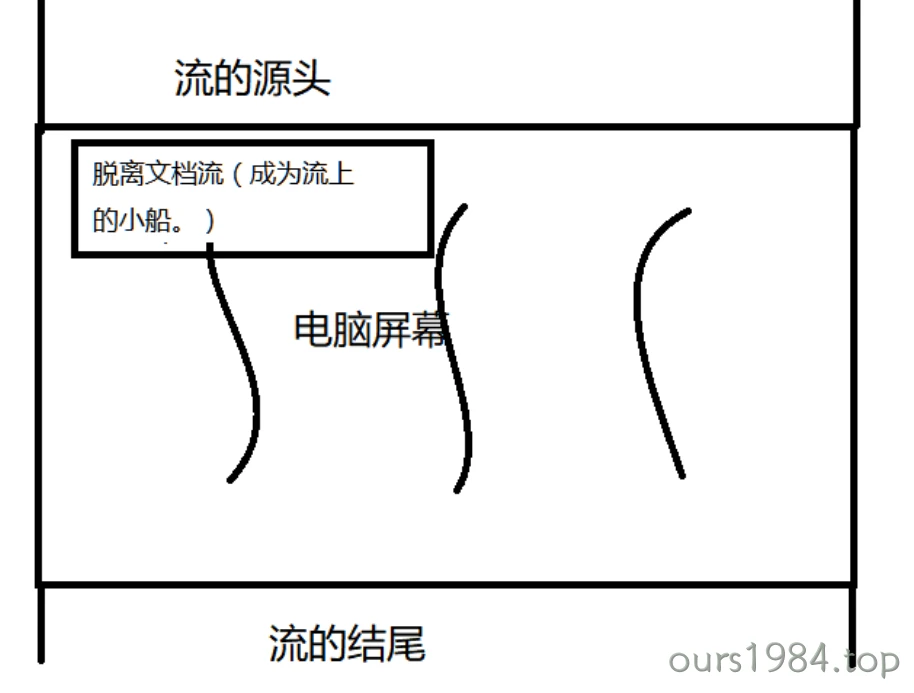
脱离文档流
但是仅有的两种排版,就满足了我们的需求吗?肯定是不够的!!应该有一种更加自由的变换,从而满足多样的世界。有三种方式脱离文档流:
- position:absolute
- position:fixed
- float
将文档流比作是河流的话,水就相当于文档流里面的元素。而脱离文档流就相当于脱离水跑到水的上面飘着,就像河流上的小船。
文档定位position
position属性取值含义如下
| 值 | 描述 | 参照物 | 定位规则 |
|---|---|---|---|
| absolute | 生成绝对定位的元素 | static定位以外的第一个父元素 | 通过"left","top","right"以及"bottom"属性进行规定 |
| fixed | 生成绝对定位的元素 | 浏览器窗口进行定位 | 通过"left","top","right"以及"bottom"属性进行规定 |
| relative | 生成相对定位的元素 | 自身在文档流中的位置 | "left:20"会向元素的LEFT位置添加20像素 |
| static | 默认值 | 没有定位 | 元素出现在正常的流中(忽略 top, bottom, left, right 或者 z-index 声明) |
| sticky | 粘性定位 = 静态定义 + 固定定位 | 浏览器窗口进行定位 | 当到了设置好的位置时,就自动悬停住了,采用固定定位 |
| inherit | 规定应该从父元素继承position属性的值 |
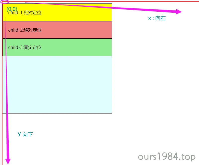
child-1:相对定位相对定位相对定位相对定位
child-2:绝对定位绝对定位绝对定位绝对定位
child-3:固定定位固定定位固定定位
child-4:粘性定位粘性定位粘性定位
<div class="testPosition"> |